Why We’re Changing the MyFitnessPal Color Palette — Again
Change is hard, especially when you’ve gotten used to something. Just take the review below from a MyFitnessPal member as an example.
⭐⭐⭐
Changing the colors?
Why? The new ones look so bad I had to write a review. Monochromatic and then just some weird ones for the macros? Fire the designer and change it back.
Ouch … and hey, we get it. When an app you use every day switches things up, it can be pretty jarring. But, we want you to know these color changes weren’t made on a whim.
Keep reading for the inside scoop on our decision to update our color palette; particularly, the colors representing nutrition data like calories and macronutrients.
MEMBER FEEDBACK
We’re always listening to member feedback through app store reviews, community forums, our service and support teams, and reddit groups to understand what’s working (and what isn’t) within MyFitnessPal.
Over and over, we heard three types of requests:
MAKE MACRONUTRIENTS GOOD AGAIN
“It’s still a shame how fat is still red, when red is so commonly associated with bad/not allowed things.” – App store review
Color can have a powerful psychological impact. To many people, red screams things like, “Warning!” “Alert!” and “Stop!” In the case of our previous Fat color, it said “Hey, this stuff is bad!”
This was definitely not our intent. We agree with the reviewer above (and with everyone else who reached out with the same feedback): Fat shouldn’t be vilified or associated with “stoplight” colors at all. We want our members to embrace fat as a healthy part of their balanced diets.
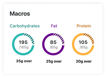
So … we changed it! Fat is now purple, and Protein (our previous purple) is now dark yellow.
Before: Fat used to be represented by red.
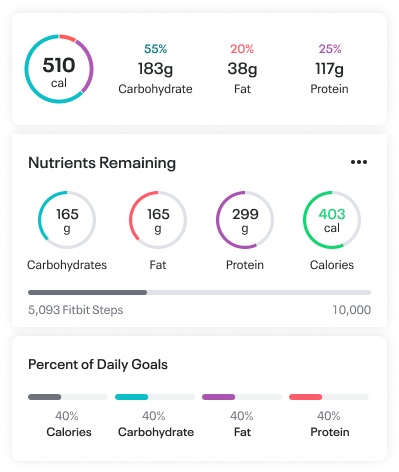
After: Now, it’s a (judgement-free) shade of purple.
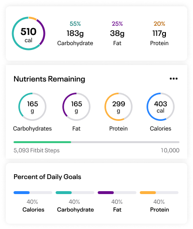
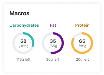
Here’s a look at our new-and-improved macronutrient colors, and a sneak peek of the updated Macronutrient Summary Cards that will be coming soon.
EASIER ON THE EYES, PLEASE
⭐⭐
“It’s not the biggest issue but I’m colour blind and having trouble distinguishing between my fat and protein now!”
Let’s talk about accessibility for a sec. At MyFitnessPal, our vision is to be the global catalyst for every body to achieve their healthy. That means building an accessible app that allows every MyFitnessPal member to have a great user experience, regardless of ability or how they use their devices.
Take our new macronutrient colors. If you do not have a sight impairment, you will see the below colors as quite different and distinguishable.
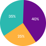
Here’s how those same macronutrient colors look to people with the eight types of color impairments:
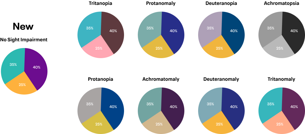
We tested many three-color combinations to find one that would work for everyone, no matter how they see color. The colors had to be easily differentiated in terms of tone (each color against the next), and dark enough to contrast with the white text inside them.
LET THERE BE LIGHT — AND DARK!
⭐
“This is the only app on my phone that doesn’t have dark mode. It’s a shame! Update: 2021, Google maps got the night mode, and myfitnesspal still blinds me every time I use it.”
Creating an accessible app isn’t just for those with disabilities. It’s also for older users whose eyesight is changing, and those who want to view the app comfortably in the bright sunlight or in a pitch-black room.
Color, contrast and brightness are all factors in how we experience the world around us, including on our mobile devices.
MyFitnessPal’s old (and new) meal calorie colors are a good example:
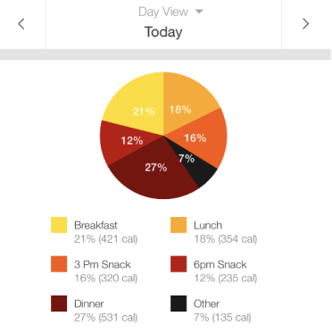
With our old meal colors above, white text can be difficult to read against lighter yellows and oranges. The pie chart above is inaccessible to those with visual disabilities. This palette is also glaringly bright (and hurt our testers’ eyes) in dark mode.
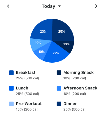
With our new meal colors seen above, white text now passes accessibility testing, and there is enough contrast between colors based on color tone (light versus dark). This palette also works better in dark mode than the old one.
CLICK TO TWEET THIS ARTICLE > See how @myfitnesspal is improving app accessibility through color. #myfitnesspal
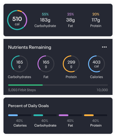
Yes, you read that correctly. Dark mode is coming! Keep an eye out for more information about our dark mode colors, hitting your app soon. Check out a sneak peek of dark mode on MyFitnessPal below.
THE BOTTOM LINE
As you can see, color is tricky. The best color combo is uncontroversial, accessible to as many people as possible, and readable in light and dark settings.
We know change can be difficult, but we hope you enjoy these improvements and can better understand our color changes were done thoughtfully to support all MyFitnessPal members’ abilities — and to give every body a chance to find their healthy. You should see the new colors implemented the week of November 22, 2021, with dark mode following very soon!

